
We are excited to present a newly developed interactive map tool on micasa.hr, designed to provide fast and intuitive insights into real estate prices across Croatia. This project represents a concrete example of our applied work in data visualization, carried out under the umbrella of Research Elements.
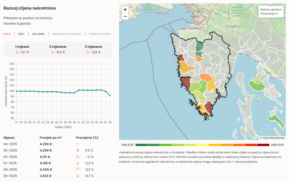 Image 1
 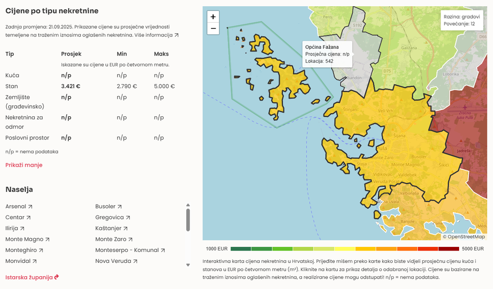 Image 2
 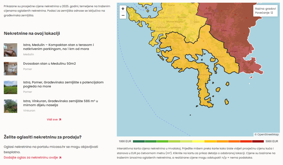 Image 3
 Project Goal
The main objective was to build an interactive map of Croatia on micasa.hr that allows users to explore property prices by region, county, city, and municipality. By combining regularly updated datasets with a responsive front-end, the tool provides valuable insights for buyers, sellers, and researchers alike.
Technical Approach
From the outset, we considered multiple technical solutions, notably Plotly.js and Leaflet. To accelerate the prototyping process, we leveraged AI-assisted workflows, which allowed us to quickly generate and test different design variants. This iterative approach enabled us to compare usability, speed, and performance between the two frameworks.
Although Plotly is a powerful library that we frequently use, our testing revealed that Leaflet performed better in this specific case. Its lightweight structure provided faster load times and smoother interaction for geographic data visualization, which proved essential for end users on micasa.hr.
Key Features
- Interactive map of Croatia with drill-down options to counties, cities, and municipalities
- Average, minimum, and maximum asking prices displayed per property type
- Trends over different time periods for easy comparison
- Data expressed in EUR per square meter for clarity and consistency
The tool in Croatian language is publicly available here: Explore the interactive map.
Conclusion
This case study demonstrates the value of comparing frameworks in practice before committing to a solution. By combining AI-assisted prototyping with systematic testing of performance and usability, we ensured that the final tool was both technically robust and user-oriented. The choice of Leaflet over Plotly illustrates how performance and responsiveness can be decisive factors, even when both libraries are capable of producing similar visualizations.
At Research Elements, we apply the same methodology across our projects, delivering web development, data management, and visualization services, including for EU-funded initiatives. Our work on micasa.hr shows how strategic design choices and iterative testing can translate complex data into accessible, actionable insights.
For more about our work and projects, visit Research Elements. If you are interested in collaborating or would like to hire us for web development, data management, or visualization projects, feel free to get in touch at [email protected].
Migrated article. Originally published on Sep 22, 2025.
Cover image: AI
Stats
- Recommendations n/a n/a positive of 0 vote(s)
- Views 58
- Comments 0